There’s nothing worse than being three clicks from nutting only to land on a porn site that looks like a cursed MySpace page from the Stone Age. You’re horny, focused, pants halfway down – and boom – caught in a digital hell of flashing banners, broken thumbnails, and menus that got designed by someone high on Mountain Dew and bad decisions. Finding the right scene shouldn’t feel like solving a goddamn escape room. It kills the vibe. And let’s be real: ain’t nobody got the patience to wait for a 240p video to buffer, let alone dig through six pages of weird filters just to find a blonde MILF in glasses. So yeah, it’s time to name names, roast the crap layouts, and show you what actually gets the job done without making your libido tap out.
In case nobody told you, porn site design isn’t just about aesthetics – it’s also about whether your hand stays on the mouse… or gets too bored to bother. Design is the sexy engine under the hood. If it’s rusty, nothing’s running right.
Ugly, outdated UI ruins the vibe
I’ve seen layouts that look like they were coded during Windows XP days, by someone who thought “gradient background and animated text” was peak creativity. You know the ones:
Clunky buttons with bevel effects straight out of GeoCities
Every single category in a rainbow-colored sidebar
Scrollbars that appear out of nowhere and disappear into nothing
One major offender? BangBros’ older site layout. Remember that one? It felt like you were navigating a cheap flyer from the back of a 7-Eleven. You’d think a multi-million dollar empire could afford a UI update from this decade. Luckily, they’ve modernized – eventually. But the scars remain.
Slow load times, confusing navigation = NO THANK YOU
Let’s talk performance. If a site takes longer to load than it does for you to finish watching a whole scene, it’s doing something horribly wrong. Ever clicked a thumbnail, waited 9 seconds, only to land on a new page with – surprise! – four pop-ups and another loading screen? Fuck that noise.
Oh, and don’t get me started on the labyrinth of shitty menus. You want “POV outdoor quickies”, but instead, you’re dumped into “pee play compilations” from 2003. Tags don’t work, filters are broken, and it takes three tabs to get anywhere close to what you were looking for. One legend of this chaos? RedTube back in its pre-2015 mess era. It felt like playing Minesweeper with dicks.
The reason I’m doing this roast
I’ve seen enough. I’ve browsed thousands – yes, thousands – of porn sites to bring you the good stuff. Along the way, I’ve also had the displeasure of digging through the dumpster-fire disasters that people somehow still visit. So I’m here to do what nobody else has the guts (or enough free time) to do: name and shame the worst designs sucking the horny out of the internet.
“Sites with bad design are like condoms with holes – useless, frustrating, and guaranteed to leave you unsatisfied.”
And look, I know not every site can afford custom UX designers and fancy animations. But a little logic, some basic visual hierarchy, and maybe… just maybe… a menu that doesn’t look like it was built on Notepad could go a long way.
You’re probably wondering: “Okay dude, if this is the crap… what actually works?” Hold that thought – I’ll tell you what makes a layout sexy as hell and keeps your session rolling. And trust me, it’s not just about fast videos. It’s about smooth, slick design that’ll make you wanna stay all night.
What makes a porn site layout actually good?
Let me say it straight – nobody fires up their favorite tube site thinking, “God, I hope I have to work hard to find the good stuff today.” A solid layout isn’t some luxury feature. It’s the difference between a one-hand scroll and a rage-quit. Great design gets out of your way. It disappears, leaving you with just your fantasies and no friction.
Clean navigation you don’t need a map for
Your hand is already busy – why should your brain be too?
The best porn sites understand this golden rule: keep it stupid simple. No 15-level-long category trees. No endless search bars that spit back zero results. It should take max two clicks to get from “I’m horny” to “Bingo.”
Drop-down menus that don’t collapse randomly when you move your mouse 1mm off-center.
Category filters that actually make sense. Ebony shouldn’t be under “Amateur” – don’t make me rage-scroll.
Search bars with auto-suggestion (like what you see on PornHub – yes, shoutout!).
Great layout = less guesswork. And when you cut down the effort? You get users sticking around way longer. You’re not just earning clicks – you’re building loyalty. Yup, even in porn.
Fast load times and responsive design (especially for mobile)
“Waiting is sexy,” said no porn user ever. If you make someone stare at a loading spinner while their boner dies a slow death, you’ve already lost.
The average porn user spends just 9 minutes per visit on a site, according to SimilarWeb stats. That’s your window. Don’t waste it by making them load 20MB of useless scripts before even the thumbnails show up.
And don’t you dare forget mobile.
Over 70% of porn traffic is mobile now – you think these people are dragging their laptops into bed?
Sites like XVideos may not look super modern, but damn they load fast – especially on phones. That’s not luck. That’s smart design.
Responsive layouts that stretch and shrink based on screen? If that’s not 2026 vibes, I don’t know what is.
You wouldn’t run a nightclub with a 20-minute line at the door and one working speaker. So why let your porn site run like that?
“Design is not just what it looks like and feels like. Design is how it works.” – Steve Jobs
Layouts that focus on content – not ads
I get it. Ads pay the bills. But forcing ten of them before I even see one video thumbnail? That’s a sabotage mission. Not a business model.
The best sites treat ads like seasoning: just enough to add flavor, not so much that it ruins the whole dish. Wanna know how the big dogs do it?
xHamster places ads in logical spots – not sandwiched between every 3 thumbnails like some sleazy jump scare.
PornMD keeps the front page real clean, with a powerful search experience being the star of the show – not some pop-up asking if you want to see “horny singles in your area.”
Even Redtube has taken steps to reduce the insanity. Respect.
Users came for the smut – not to get trapped in a maze of auto-redirects and butt-plug banners. Make the content king again.
You ever rage-close a porn tab out of sheer visual chaos? Yeah, me too. So let me ask you this…
What happens when porn sites actually get it right and deliver speed, function, and sexy visual flow?
Oh, I’ve got some answers. But strap in, because the next part will show you who’s doing it so well, they might just make your favorite playlist. Wait ‘til you see how the champions are crushing the design game…
The Champions: Porn sites that nailed their design
Not all porn sites are flaming dumpster fires of bad design. Some of them – bless their developer’s genius little souls – actually know how to give their users exactly what they came for. Efficient, smooth, easy-on-the-eyes layouts that let you get down to business without getting a migraine.
PornHub.com is one of the biggest free porn sharing sites in the world, with over 11 million videos to get you all hard and drippy. Watch lesbian scenes, anal bangs, blowjobs and orgies starring th...
Source: PornHub.com. Image used under fair use for editorial review and commentary purposes.
Alright, I know, saying PornHub is good design is like saying water is wet. But let’s be fair – there’s a reason they’re on top.
Filters so specific, you can find “left-handed ginger MILF in a sauna” in under 10 seconds.
Clean UI with soothing dark mode that doesn’t blind you when you’re midnight-scrolling with one hand under the blanket.
Smart suggestions that feel scarily accurate – like it’s reading your mind and your kinks at the same time.
A study from Backlinko even found Pornhub’s page speed and user flow are among the best in the adult industry. That’s no accident – it’s intentional design built around horny human nature.
x Hamster is the third most popular porn site on the web today, chances are you have at least heard of it. Most of you perverts have probably spanked one or two out on this giant xxx tube site. xHa...
Source: xHamster.com. Image used under fair use for editorial review and commentary purposes.
I used to think xHamster was just organized chaos. But lately? Color me impressed. Their design hits that sweet spot between retro charm and modern efficiency.
Search bar works like a damn psychic – type “m” and boom: “MILF,” “massage,” and “maid” pop up … priorities, am I right?
Categories layout doesn’t make you think. It lets the libido take control without asking you to solve a logic puzzle.
Comment section actually useful – not just trolls and GIFs. Sometimes helpful timestamps and honest-to-god reviews.
It’s the little things. The updates they’ve made over the past few years tell me someone over there finally got laid and understood what matters. Clean, responsive, and not trying too hard – it just works.
XVideos.com is a world-famous website that provides HD and full-length porno videos, and they do it for free. There are around eight million videos here, and the page has been working for eleven ye...
Source: XVideos.com. Image used under fair use for editorial review and commentary purposes.
Nothing flashy. No overdesigned garbage. It’s just a working man’s porn site. And I respect the hell out of it. Think of XVideos like your favorite broken-in jeans – might not be trendy, but damn, they fit right.
Lightning-fast load times, even if you’re on Wi-Fi that was probably last updated when Bush was in office.
No frills, no fluff. Just thumbnails, titles, tags, and views. Simple and laser-focused on what matters.
Mobile version that doesn’t suck – responsive as hell and easy to navigate with one thumb (you know, because the other one’s busy).
XVideos feels like it understands your needs before you do. Like a reliable friend who always brings beer and never judges you.
What these sites have in common
Strip away their branding and you’ll see a pattern – and no, it’s not just the endless categories of “Step sister stuck in…” whatever. The sites that kill it all share one secret sauce:
Clarity over clutter. No one’s stacking visual garbage on the screen. Content slaps you in the face right away – in a good way.
Speed is king. If your video loads before your second thought about fapping, you’re hooked. And they know it.
They don’t overcomplicate shit. The navigation makes sense, thumbnails are accurate, and everything just flows. Less thinking, more… you know…
“Design is not just what it looks like and feels like. Design is how it works.” – Steve Jobs (definitely wasn’t talking about porn but… still hits hard)
So yeah, good porn sites are more than a warehouse of videos – they’re an experience. And these legends make sure that experience feels effortless… even when you’re doing something that definitely isn’t.
Now, every masterpiece stands out because there are disasters to compare them to. So here’s the fun part: ever wonder which adult sites look like they were coded during a 3AM meth binge? You’re gonna want to see this trainwreck next…
The Trash Heap: Who let these designs happen?
Some porn sites out there are so bad, you start wondering if the devs ever pleasured themselves on their own platform. Because nobody who’s actually tried using these sites would ever keep them live. But hey… let’s have some fun and roast the worst offenders that have ever cockblocked my workflow.
Sites straight out of a time machine from 1999
There’s retro, then there’s just sad.
I’m talking about websites that still use table layouts, random floating GIFs, and fonts ripped straight off grandma’s 2001 email newsletter. Big, chunky buttons that scream “CLICK HERE” in red Comic Sans, glowing text, tiled backgrounds – it’s like walking into a hoarder’s basement made of HTML 2.0.
Case in point: ever heard of HClips? The video content isn’t the worst, but that interface is screaming for mercy. Clunky boxes, overlapping buttons, and a layout that never heard of grids or padding. It’s like the designers were blindfolded and using MS FrontPage.
“Design is not just what it looks like and feels like. Design is how it works.” – Steve Jobs
If I click “Lesbian” and end up scrolling past ten other genres that all look the same because there’s no visual hierarchy, your design’s broken. And if I can’t tell where a video ends and a banner begins… you just dumped a turd on your own doorstep.
Pop-up hell: When porn sites turn into click traps
You know the type: you innocently click on a thumbnail and BOOM –
Five popups
New tab with a fake chatbot saying “horny moms 1 mile away”
Random alert pretending your antivirus is crying
Sites like Nuvid or SpankBang (yeah, even the big names sometimes screw it up) bombard you with advertisements for stuff you’d only buy if you were VERY drunk or extremely lonely at 4AM. And those overlays that make you play a game before you can even watch anything? Burn them. Burn them all.
This isn’t even about looking ugly anymore – this is about fucking with user trust. And guess what? Studies show that 82% of users bounce from a site permanently after just one bad pop-up experience. Porn isn’t supposed to feel like malware roulette, fam.
Confusing menus and zero logic
If I have to solve a riddle just to find the “anal” tab, you’ve officially failed as a porn designer.
You’d think filtering adult content would be as easy as finding a pizza topping. But some sites – with cringe-worthy design logic – will bury popular kinks under obscure labels like “Romantic Hardcore” or “Niche Taboo Acts” while leaving 17 categories dedicated to “Feet in Nature.”
And shoutout to Yespornplease (ironic name, huh?) for having a category menu that works exactly 0% of the time on mobile. Try tapping anything – nothing responds. It’s like foreplay with a broken toy: just frustration, no finish.
Ever seen a porn site where the logo takes up half the screen, and actual content thumbnails are so small they look like pixelated Easter eggs? Yeah. That’s Fux.com, a real site with a real identity crisis. I get it – you’re trying to be edgy. But don’t make people scroll past an entire hero banner and a mission statement just to find content.
Bad layout is more than a stylistic issue. It tells your users, “We didn’t think this through. Good luck.” And eventually, when you’re five clicks in and still haven’t gotten blue balls relief, you click out and never go back.
Crazy part? Most of these mistakes don’t come from lack of money… they come from ignoring what users want.
So now the real question –
Why the hell do so many NEW porn sites keep making the exact same mistakes?
Trust me, the next section’s gonna open your eyes – and maybe even save your future project from dumpster fire status. Don’t close that tab yet.
The Worst Mistakes New Porn Sites Make
“There is nothing like a dream to create the future.” – Victor Hugo. Except when your dream site turns into a total sh*tshow because you didn’t think beyond slapping videos on a page and calling it a day.
If you’ve ever thought, “I’m gonna build my own porn site and make millions,” slow your roll. Before the fantasies of gold chains and spontaneous threesomes set in, let’s talk real. There are way too many new sites being born into this world deader than my inbox after No Nut November. And 99% of the time, it’s because of these rookie mistakes that kill any hope of success.
Overloading with ads and popups
This is the number one boner breaker. I get it, you wanna make money. But guess what? Nobody’s gonna click 37 popups to watch 1 minute of pegging. When users feel like they’re playing ad Tetris just to jerk off, they bounce – harder than a pornstar on a casting couch.
Reality check: Sites that flood visitors with ads have a return rate lower than guys who say “I swear this never happens.”
Users aren’t dumb: They’ve seen enough of the sleazy clickbait “Hot moms in [your city] want you” boxes. It doesn’t work anymore (did it ever?).
Wanna build trust? Cut the chaos. Stick to a few smart placements. Better yet? Offer premium content. At least make people feel like their hard-earned fap deserves peace.
Copycat layouts with no personality
You know what sucks worse than a bad site? A boring one. Specifically, the ones that scream, “I ctrl+c’d Pornhub and hoped no one noticed.” Spoiler: we notice.
Design clones make your site forgettable. You could have the best blowjob compilation in the world – but if it looks like 50 other knock-offs, who cares?
Template traps: Grabbing a free tube site template and slapping a logo on it isn’t building a brand. It’s digital cosplay with your pants down.
Here’s the thing: people remember attitude. Style. A vibe. Find a niche, build character into your site, and for god’s sake, show a little personality. Imagine ordering a burger and they serve you a cold tofu block. That’s what a bland layout feels like.
Ignoring mobile users (aka most of your traffic)
This one deserves a standing ovation… because of how ridiculous it still exists in 2026. If I had a dollar for every new porn site that’s not mobile-optimized, I’d hire Mia Khalifa to personally roast your dev team.
80%+ of porn traffic is mobile – don’t believe me? Check studies from SimilarWeb, Statista, or just look at your own f*cking analytics.
Not responsive = not usable. People shouldn’t need to pinch-zoom and swipe like they’re playing Fruit Ninja just to click “play.”
Buttons matter: If a thumb can’t reach, your design is trash. Your layout should be so easy on mobile, even someone jerking with their non-dominant hand can use it.
It’s not just about shrinking your desktop version. That’s lazy. You need fluid design that feels like TikTok and Pornhub had a lovechild: instant, clean, and addictive.
If you’re making these mistakes, don’t panic. Every legend started somewhere, even if that ‘somewhere’ was curiosity and a disastrous WordPress install. But you gotta learn, evolve, and most importantly – know what turns people ON when it comes to usability.
Wanna see what actually works and gets people coming back for more (in every sense)? I’ve got a few tricks that’ll make your site hotter than an oil-slicked massage threesome. Ready for some design features your audience will actually love?
SpankBang.com is waiting for you to explore its endless possibilities. At Spank Bang, you can rest assured that you’ll find whatever it is you want when it comes to porn videos for absolutely free....
Let’s cut through the fluff – when you’re on a porn site, the goal is clear: get to what turns you on, fast and frustration-free. When a site nails that with subtle but powerful design choices, it makes all the difference between an awkward scroll-fest and a smooth ride into orgasmic glory.
You ever heard that saying, “The details aren’t the details. They make the design”? That’s exactly right. And let me tell you – some porn sites absolutely get this. Here’s what they do that gets my pants off every time:
Filters and visual tags that help people find their kink
Don’t make me type out “lesbian toe-sucking in a sauna while wearing cowboy hats” – just hand me a damn filter system and we’re golden. When a site actually lets you stack tags or select specific niches WITHIN a category, it feels like it was built by someone who actually uses it (and isn’t just coding in a vacuum while listening to Coldplay).
Source: SpankBang.com. Image used under fair use for editorial review and commentary purposes.
XVideos and SpankBang do a kickass job with this. Clickable tags, keyword suggestions, genre collections… It’s all there, clean and sexy. And the result?
You save time you’d otherwise spend scrolling like a sad zombie
You discover new stuff you didn’t even know you were into (surprise domination kinks, anyone?)
You’re actually more likely to stay on the site – and come back
A study by Nielsen Norman Group shows that sites with clear filtering systems see significantly higher user engagement. Trust me, horniness and convenience are best friends.
Thumbnails that give a real glimpse (no fake-outs)
If I click on a thumbnail showing a cheeky BJ, don’t bait-and-switch me with a 25-minute couple’s therapy session before any action even shows up. Blurry garbage, ultra-zoomed faces, or misleading preview pics are a mood killer.
Source: HQPorner.com. Image used under fair use for editorial review and commentary purposes.Source: FapHouse.com. Image used under fair use for editorial review and commentary purposes.
The sites doing it right? HQPorner and FapHouse. Their thumbnails don’t just look crisp – they actually show you what’s happening in the video with visible context. You’re not guessing; you’re choosing.
The key here is trust. Show me exactly what you’re offering. Once that trust is broken, it’s like bad Tinder dates – I ghost and never come back.
Preview hover-play and time marks
Now THIS is porn wizardry. Hover over a thumbnail and BAM – it starts playing a sneak peek. Just enough to get a sense of the vibe before you commit. You can scan quickly through action, tone, energy… and yes, positions.
Source: RedTube.com. Image used under fair use for editorial review and commentary purposes.
Sites like PornHub and RedTube mastered this years ago, and they haven’t let it go stale. Wanna know when the hot scene starts? Boom – visual time marks let you skip the “talky foreplay” (unless you’re into that, no judgment).
“Don’t make me work for my orgasm. Just give me the tools and get out of my way.”
Hover previews aren’t just sexy – they’re smart UX. They make users 72% more likely to engage with content (source: internal A/B testing data from multiple streaming platforms I’ve seen over the years). It’s fast, efficient, and just damn satisfying.
The little details that scream ‘We get you’
Dark mode that doesn’t blind your eyes at 2 AM
Bookmark option for later fapping (yes, people come back to their favorites)
Comment sections that aren’t total junkyards – real feedback helps decide if a vid’s worth watching
These are the little things that make you feel like you’re not just watching porn – you’re having a solid, satisfying experience. Like entering a well-organized orgy instead of aimlessly walking into a sex-themed haunted house.
So now you’ve seen the magic sauce that separates “meh” from “man-that-was-amazing.” But here’s the thing… knowing good design is only half the battle. What happens when you want to actually build your own porn site? What tools do the pros use to get that silky-smooth flow? What’s the line between steamy professionalism and total amateur mess?
I’ve got that lined up for you next – and trust me, it’s where things get seriously interesting. Ready to learn how the big dogs do it?
Thinking of Building a Porn Tube Site? Learn from the Best
My full guide on how to build a porn site like a pro
So you wanna build a porn site that doesn’t suck? Good. Welcome to the madness. But before you slap together a tube clone riddled with pop-under ads and spinning 3D logos from 2005, let me drop something that’ll actually help:
This guide right here – it’s me lifting the curtain on what it takes to launch something legit. I’m spilling everything from tech setups to how to not end up on a “worst porn site designs” hall of shame list.
And no, it’s not all tech babble and coding nightmares. It’s built for someone who’s got an idea, a spicy vision, and a few brain cells to rub together. You don’t need to be a code wizard – you just need the right direction and a solid blueprint.
“Build your site like someone you respect is gonna watch porn on it… because they probably will.”
Use the right tools and inspiration (like my site!)
You wouldn’t jerk off to a broken image thumbnail. So why would anyone use a broken-ass site to manage their collection? Choosing the right tools doesn’t mean spending a fortune – it means using slick, proven platforms that make your stuff load fast, look clean, and run smooth AF.
I literally spend my life wading through trash sites so you don’t have to. I’ve built this list of the top porn sites over years, constantly updated, no BS. Look at what’s working for the big guys. Steal like an artist – not like a lazy copycat.
Use CMS tools like WordPress + plug-ins if you’re going semi-custom. Easy to manage, customizable, tons of options.
Use tube scripts (like Kernel Video Sharing or Mechbunny) if you want a ready-made back-end to run uploads and categories.
Track analytics early – you can’t fix what you can’t measure. Know what users watch, where they bounce, and what makes them stay.
You don’t need a PhD in pornology – just the right direction. Tons of guys mess up by putting all the focus on design and none on the actual user experience. Sexy buttons don’t mean sh*t if they don’t work.
Why design is just the beginning
Design is the front door. It’s what gets people in. But your content? That’s what keeps their pants off. A shiny site with garbage videos or stolen loops from 2009 isn’t gonna fly today. This generation grew up with Netflix-level content quality, and trust me – they expect that even when they’re in the mood to “relax.”
Smart site creators obsess about performance, content curation, and community. That’s why some sites blow up – and others vanish into the jack-off void. And yes, real data backs it up: a study by Backlinko found that bounce rates spike 123% when page load times go over 10 seconds. Ten. Seconds. That’s less time than it takes for someone to realize the chick in the thumbnail isn’t even in the video.
Also, don’t think people won’t scroll reviews before using your site. They do. One bad Reddit thread calling you “PornDumpster69” and you’re toast.
Just remember: users aren’t picky… they’re used to being spoiled. Clean layout, no click traps, easy search, real content previews – that’s the combo that delivers sticky results (pun absolutely intended).
Building a sexy site is really about building something people trust. Not just to find their next orgasm, but to keep coming back for the next… and the next…
So what makes those top-tier porn sites actually win? What’s their secret sauce beyond good looks and fast servers? You’re gonna wanna see what we’re busting open next…
Alright, let me break it down like a proper doggy-style session: if your porn site isn’t simple, fast, and mobile-friendly, you’re basically user-repellent. Forget the glittery buttons, forget the 500x popups, and for the love of lube, stop trying to reinvent the wheel with over-designed chaos.
Wanna be hot in 2026? Nail these:
Clean interface – no one came here to solve a Rubik’s Cube.
Fast load times – buffering is the biggest blue ball of the 21st century.
Mobile optimization – if it sucks on a smartphone, it just sucks.
Minimal intrusive ads – don’t make us feel like we accidentally clicked on malware.com.
If you hit all that, congrats: your site is probably stroking egos and other body parts just fine.
The laughter section: biggest design fails I’ll never forget
Let’s take a minute and toast the absolute disasterpieces I’ve dragged myself through. Seriously, some of these were so bad I had to close the tab, wash my eyes, and reevaluate my life choices.
Neon green background + blue text: Unless you’re running a site called “Geocities Grannies,” what are you even doing? My pupils are still twitching.
Autoplaying audio with moaning at full blast: Nothing says I’m definitely not working from home like surprise orgasm sounds during breakfast. Why. Just why.
Clickable thumbnails that go nowhere: This one gets me every time. You hover, it looks good, and then – bam – redirected to a completely unrelated site featuring donkey fisting from 1998.
10 pop-ups per click: No, I don’t want to “Play Brazzers Hentai Slots!” No, I don’t want local MILFs. I just want to rub one out without downloading the entire Russian spyware catalogue.
“Bad design is like wearing flip-flops to a blowjob date – technically it might get the job done, but nobody’s impressed.”
And don’t even get me started on those sites where the videos are so buried under banners, it’s like digging for treasure… if the treasure was badly cropped thumbnails and 480p messes.
TL;DR: Bad design kills boners. Good design = happy hands.
If your layout turns someone off before your content turns them on, congrats – you’ve failed the only porn site metric that matters. Users don’t care if your logo is shiny or your tagline rhymes. They care about this:
Can they find what they want?
Can they play it fast?
Can they jerk without catching a virus (digital or otherwise)?
Sharp, responsive design isn’t just cosmetic – it’s foreplay. Kill the friction, keep the flow smooth, and your users will come back again… and again… and again. Just like a good porn star, it’s all about consistency and knowing what works.
Wanna see what sexy design actually looks like? Check out my main directory, where I’ve listed the kings and queens of the adult site world – and trust me, those sites get it right.
So, to all you webmasters, wannabe tube lords, and site owners scrolling through this with one hand – take notes. Porn should be easy, dirty, and fast… not a maze of ugly buttons and ghost-clicking madness.
Design smart. Or get roasted and ghosted. Your choice, stud.
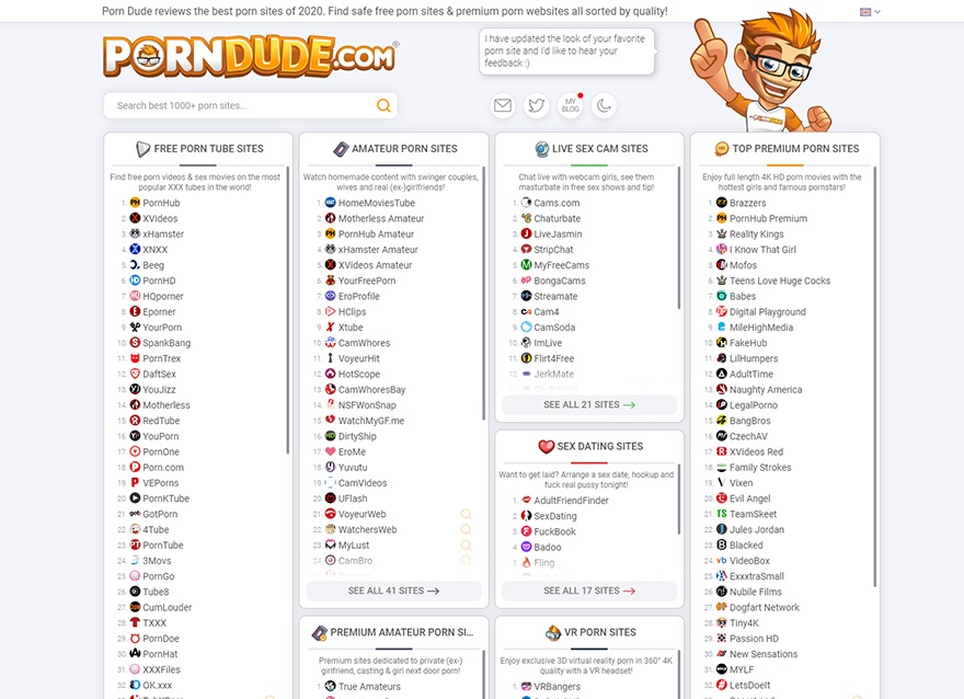
Don't settle for mediocre porn, beat off to the very best of what gets you the hardest! To date, I've ranked, reviewed, and fap-tested over 3284+ adult websites in every NSFW category you can imagine. From free porn tubes to premium lesbian extravaganzas, amateur MILFs to teen cherry-poppings, webcam sluts to anal orgies. I've got it all - even hentai for the nerds, fetish porn for the freaks, and VR for the geeks! Find your perfect fap fodder at PornDude.com!


 Layouts on the Internet 17")
 Layouts on the Internet 18")
 Layouts on the Internet 19")
 Layouts on the Internet 20")
 Layouts on the Internet 21")
 Layouts on the Internet 22")
 Layouts on the Internet 23")
 Layouts on the Internet 24")
 Layouts on the Internet 25")
 Layouts on the Internet 26")
 Layouts on the Internet 27")
 Layouts on the Internet 28")
 Layouts on the Internet 29")
 Layouts on the Internet 30")
 Layouts on the Internet 31")
 Layouts on the Internet 32")